Visualizing the shift in Bosnia's ethnicity in after the war
Bosnia & Herzegovina
By Marko Stanic
ethnic cleansing, bosnia, ethnic diversity, ethnic tensions, ethnic division, bih, bosnia and herzegovina
The project provides a visual representation of the changed ethnic landscape in Bosnia. Since the war, ethnic composition has changed.
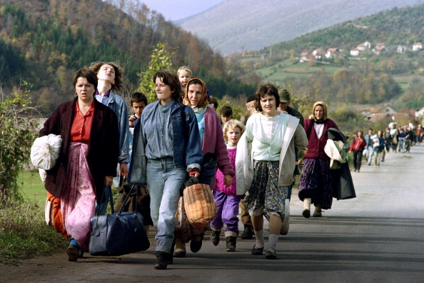
In 2013, the government of Bosnia & Herzegovina conducted its first national census since the war ended there in 1995. The last census to be conducted was in 1991, just one year prior to the start of the hostilities. I had decided to map(visualize) the Bosnia’s new demographic, focusing on the country’s three major ethnic groups: Bosnian Muslims (Bosniaks), Bosnian Croats, and Bosnian Serbs. Since the war of 1992-1995 was marked by ethnic cleansing and ethnic violence, I was curious to see the impact the conflict may have had on the Bosnia’s ethnic groups. The 1991 was the country’s last census before the war, and the 2013 was the first since. The contrast in the two reports shows a dramatic change.

The first step was locating the necessary data (the censuses). The 2013 Census was readily available, though the 1991 census did take some time to locate. As I was focused on seeing the changes within the Bosnia’s three major ethnic groups (Bosniaks, Croats, Serbs), I had eliminated data pertaining related to ‘other’ groups, undeclared, no answer, and Yugoslavs.
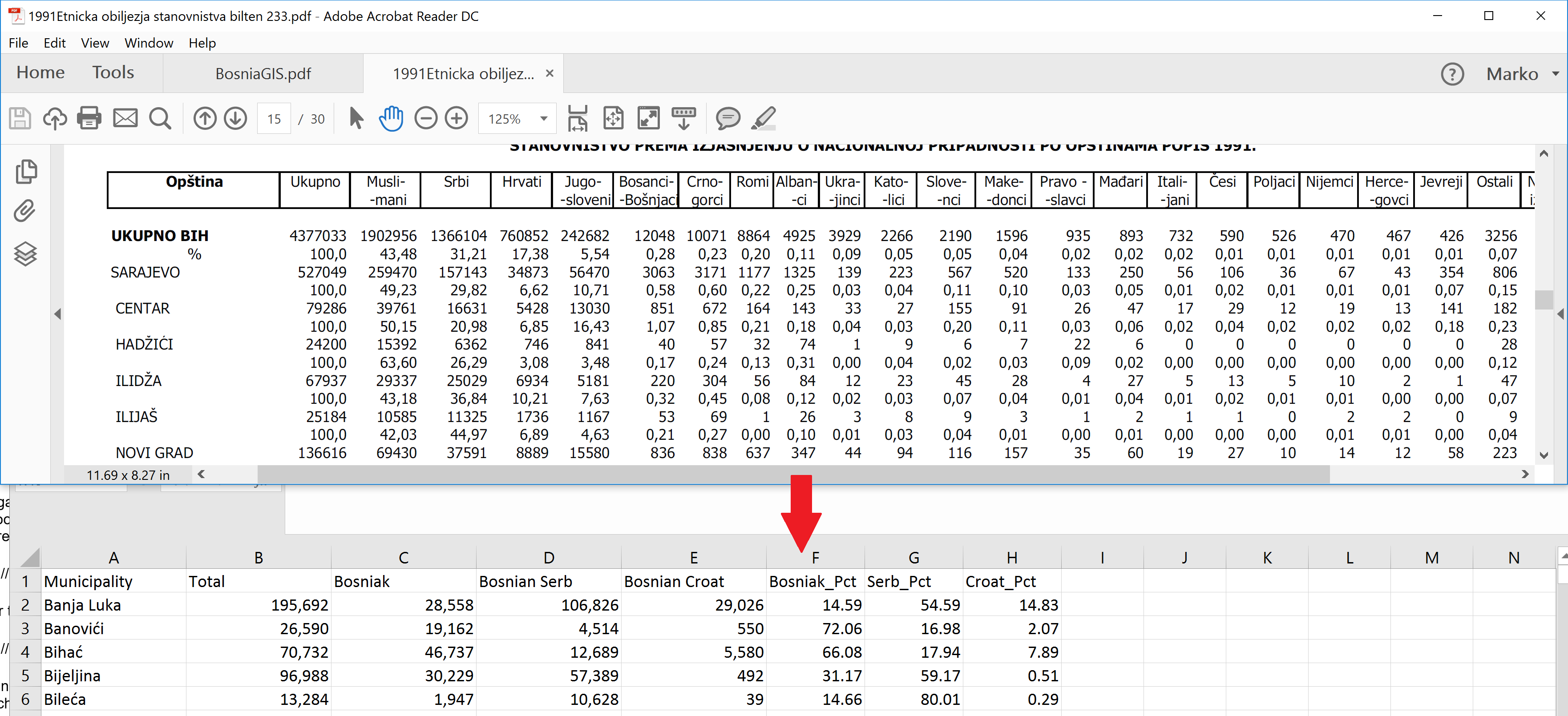
Sorting through the data, including transferring the numbers from PDF into Excel, required most of my time in this project. Once I had the data in a usable format, the next step was to locate the shapefile containing Bosnia’s 1991 municipal boundaries. Finding the 1991 boundaries in a usable (GIS) format was a challenge as major databanks (Natural Earth, ArcGIS, etc.) only had present, not historical geometries. I was lucky enough to come upon Andreas Beger (a data scientist, who also had a project needing the 1991 municipal boundaries) who created the 1991 shapefile out of scratch.
From Andy’s website: This dates back to work I did in 2008, but some people seem to find it useful: At the beginning of the Yugoslav civil wars, Bosnia and Herzegovina (BiH) consisted of 109 municipalities. Finding free geographic layers with those municipal boundaries was difficult so I recreated them from National Geophysical Data Center Coastline Extractor, using World Data Bank II. Municipality names and demographic information come from the 1991 Yugoslav census courtesy wikipedia. http://andybeger.com/2011/01/18/bosnia-1991-municipalities/
Now that I had usable 1991 census data and the 1991 municipal boundaries shapefile, I was ready to join the two and create a choropleth map, visualizing the pre-war ethnic majorities on municipal level. I couldn’t perform a simple ‘spatial join’ as the boundary shapefile did not contain identifiers for the polygons that rendered municipal borders. I took the advantage of ArcGIS’s ‘Intersect’ tool to combine the census data and shapefile polygons where they intersected.
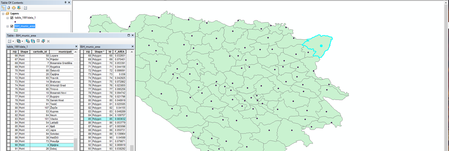
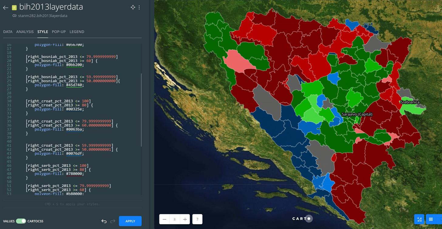
Per image above, intersect allowed me to combine overlaying features into one attribute table. As you can see, highlighting the data point and the corresponding polygon shows that, that unidentified polygon corresponds to the ‘Bijeljina’ municipality in the census data. This allowed me to export the data into Carto, where I could now join the 1991 census data to the 1991 municipal boundaries shapefile. After performing the ‘Join columns from 2nd layer’ analysis in Carto, I styled the resulting layer using greater than, less than logic to create a thematic map, showing the ethnic majorities on the municipal level.
I repeated the above process for the 2013 census data and municipalities, though the 2013 boundaries shapefile already had municipal identifiers, so I could perform the join right away in Carto, generating the next image.
With the 1991 and 2013 ethnic majorities visualized, I decided to add another element to better communicate the dynamics of ethnic conflict. I imported a shapefile from my previous work, classified as ‘suspicious surface’ that indicated areas containing minefields and unexploded ordinance. I never had the raw data to create this shapefile, instead I used a .JPG:

Since it was a flat image, I used georefrencing tool in ArcGIS to line the map to the correct projection. After that I utilized the ‘iso cluster unsupervised classification’ the extract out the red areas into a shapefile, making it usable for Carto.
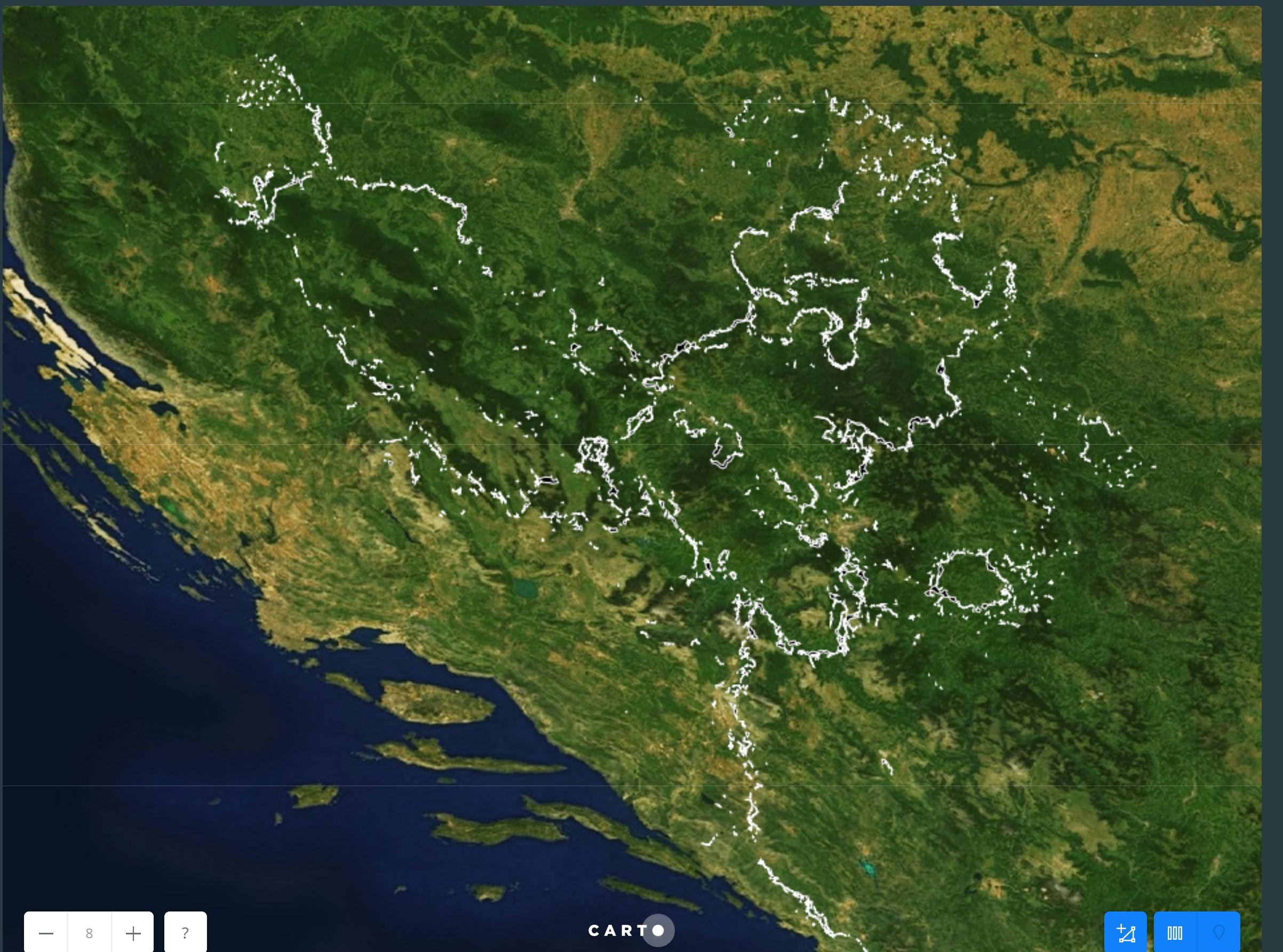
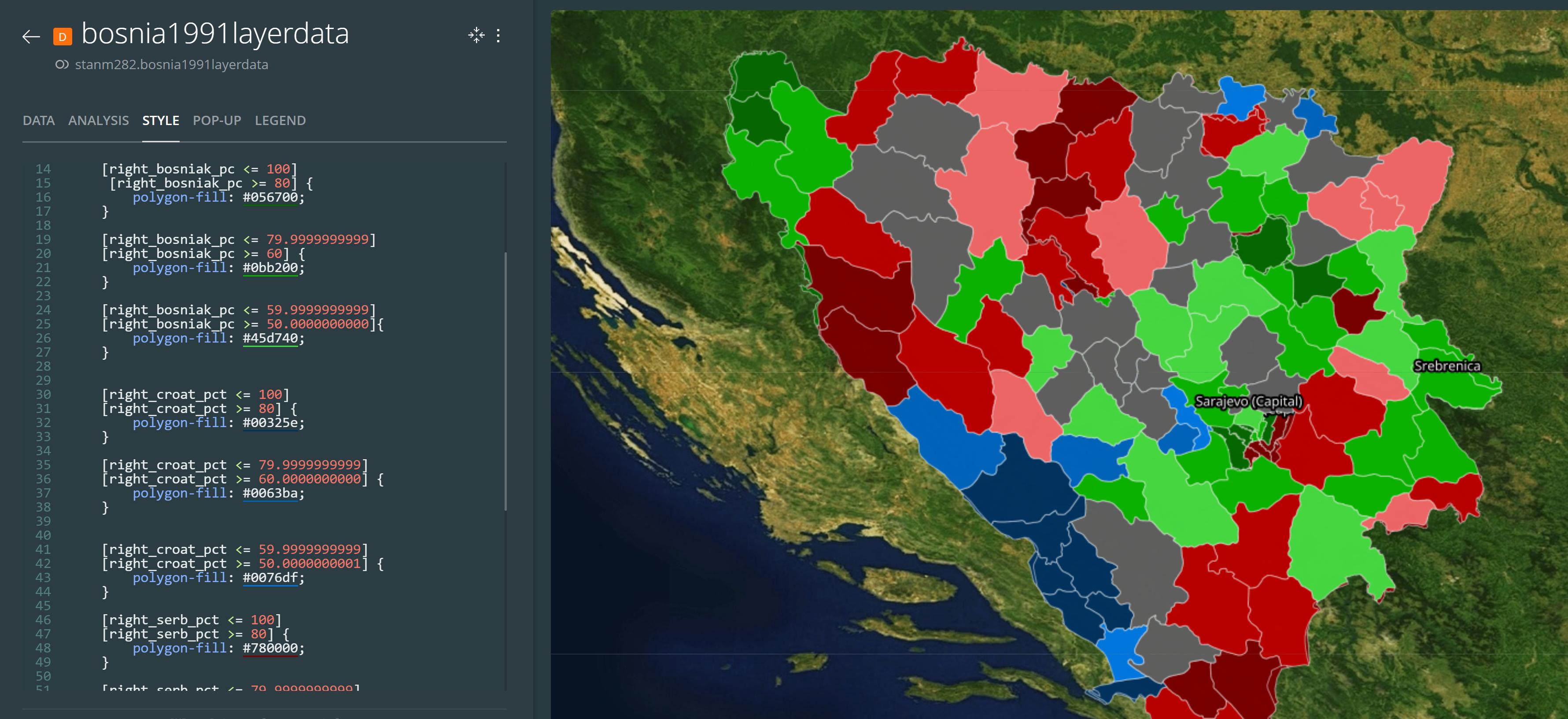
In making this project, a few things become apparent. Comparing the 1991 to 2013 ethnic majorities, we see that the ethnic groups are increasingly becoming polarized geographically. Even more interesting is the growing concentration of ethnic groups in their respective municipalities – if you look at the 1991 map there aren’t many ‘dark’ areas that indicate a 80%+ ethnic population. There are mostly ‘light’ colored areas indicating a 50-60% majority and there are many municipalities without a clear majority. The inverse is true for the 2013 census. There are many more ‘dark’, 80%+ majority municipalities, with only a few areas without a group majority. Overlaying the landmine situation layer onto the 2013 map we see that the conflict was fought along ethnic lines, dividing the country. If we overlay the landmine situation onto the 1991 map showing the ethnicity prior to the war, the placement of landmines looks almost random, and indiscriminate of ethnic groups.
- Link 1 - josipbroz86.github.io/Project/index.html